Design project / Case study
Design system: Bali / Living Harmony
01 / Context and challenge
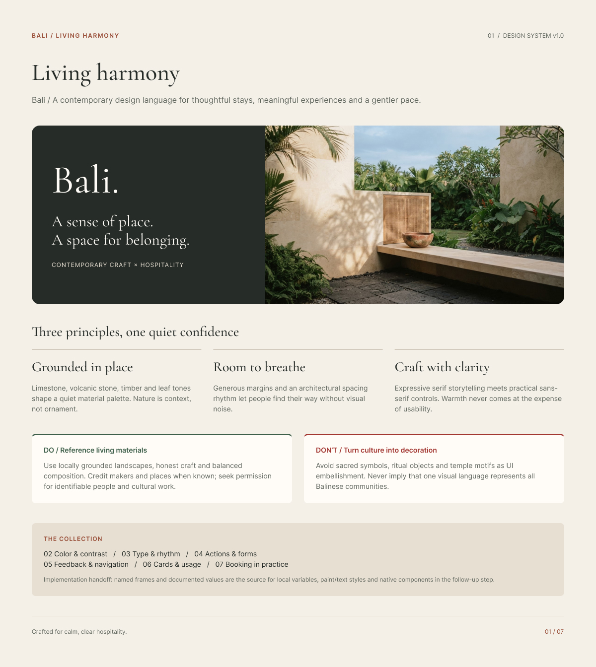
Hospitality interfaces must communicate practical information while creating a sense of place. For a Bali-inspired digital experience, the challenge was to develop a contemporary visual language that conveys warmth and a connection to the landscape without relying on cultural symbols as decoration.
The project explores how material-inspired colors, editorial typography, generous spacing, and consistent interface components can work together to create a coherent digital experience for thoughtful stays and hospitality services.
02 / Design rationale
The design system is guided by three principles: Grounded in place, Room to breathe, and Craft with clarity.
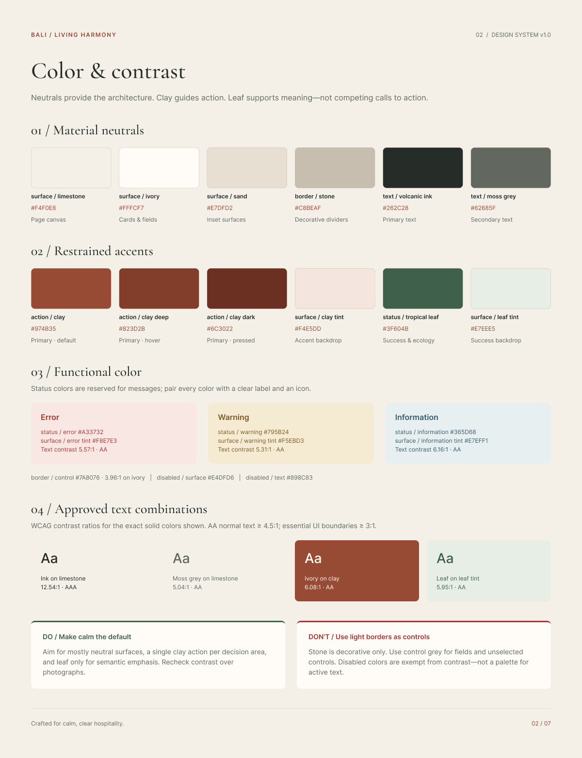
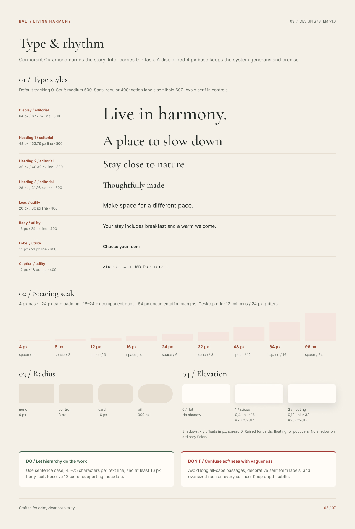
A palette of limestone, ivory, sand, volcanic ink, clay, and tropical leaf establishes a visual connection to natural materials and landscapes. Cormorant Garamond introduces an expressive editorial voice, while Inter supports readable interface text and functional controls.
Generous spacing, restrained accents, and consistent component geometry help maintain visual clarity. Rather than treating cultural identity as surface decoration, the system emphasizes material references, balanced composition, and a contemporary interpretation of hospitality.
03 / System and implementation
The design system translates these principles into reusable visual rules and interface components.
Color and contrast. A structured palette combines warm neutral surfaces with clay action colors and tropical leaf status colors. Functional colors distinguish error, warning, and informational messages, with documented contrast ratios for selected text combinations.
Typography and rhythm. Cormorant Garamond carries editorial headings, while Inter supports body text, labels, and controls. A 4 px base spacing scale establishes consistent relationships between elements, supported by a 12-column desktop grid with 24 px gutters.
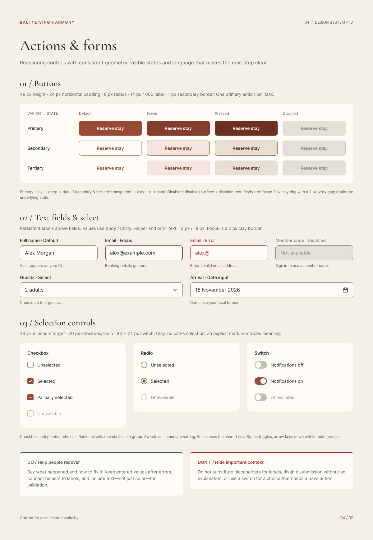
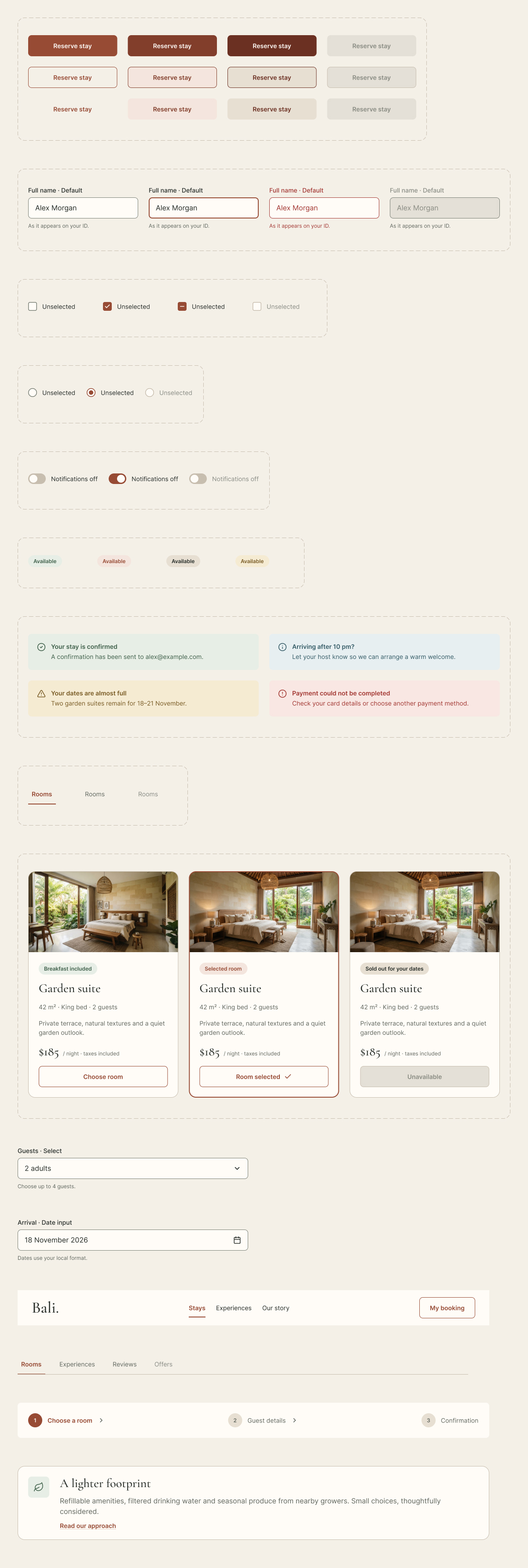
Actions and forms. Buttons, text fields, selection controls, and input states use consistent dimensions, visible focus indicators, and clear labels. Error messages include guidance for recovery rather than relying on color alone.
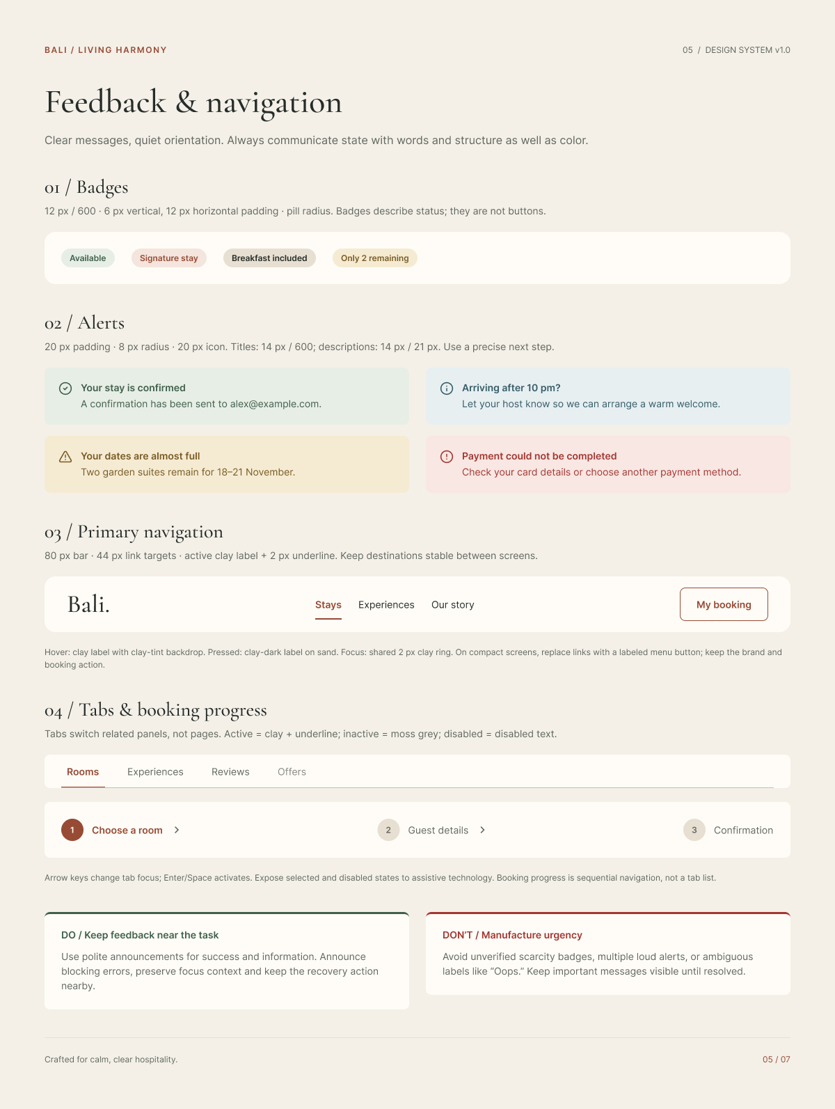
Feedback and navigation. Badges, alerts, navigation patterns, tabs, and booking progress indicators communicate status and orientation. Interaction states are designed to remain recognizable through labels, structure, and visual cues.
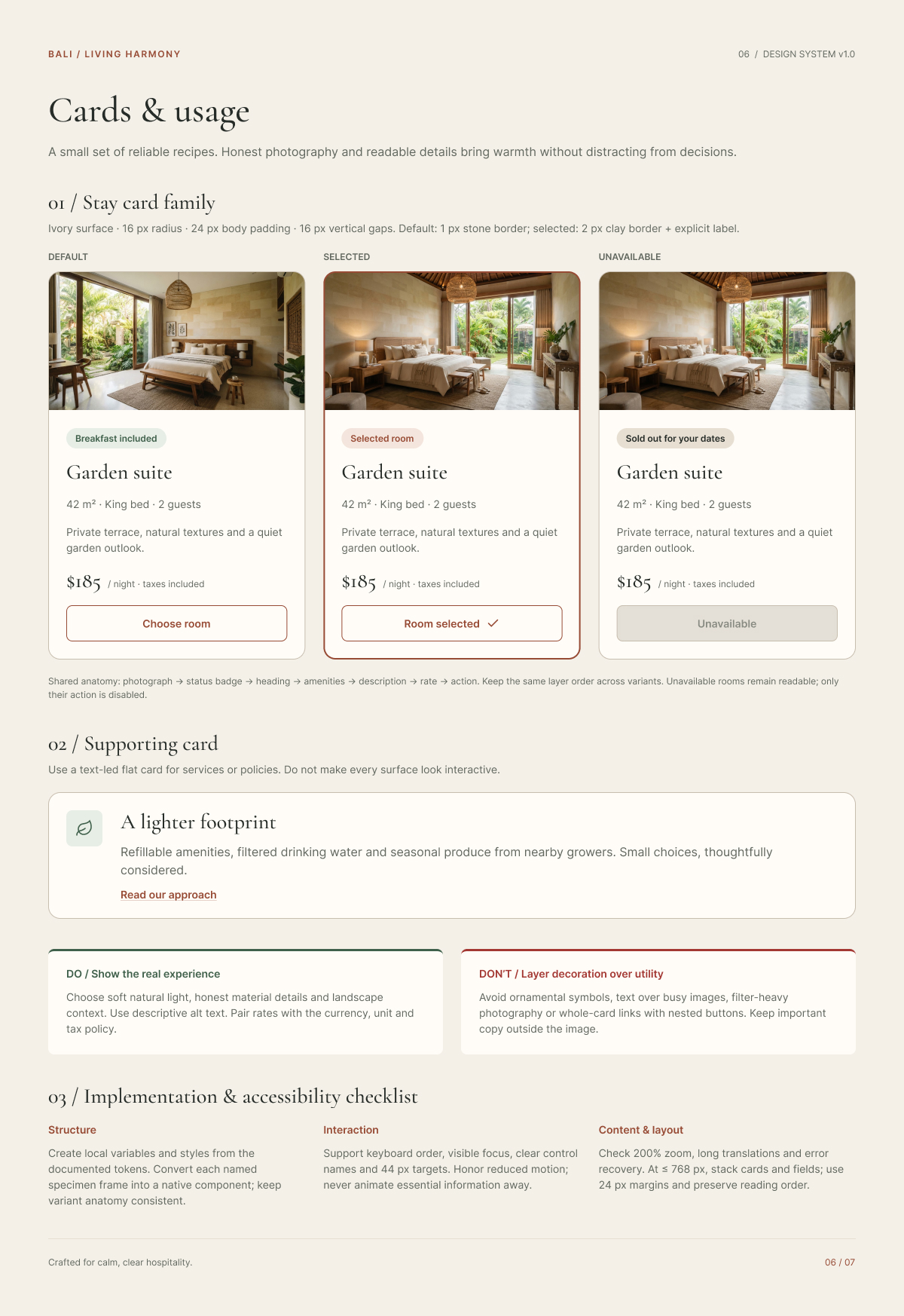
Cards and usage. Reusable accommodation cards define consistent patterns for default, selected, and unavailable states. Their shared structure keeps room details, amenities, pricing, and actions in a predictable order.
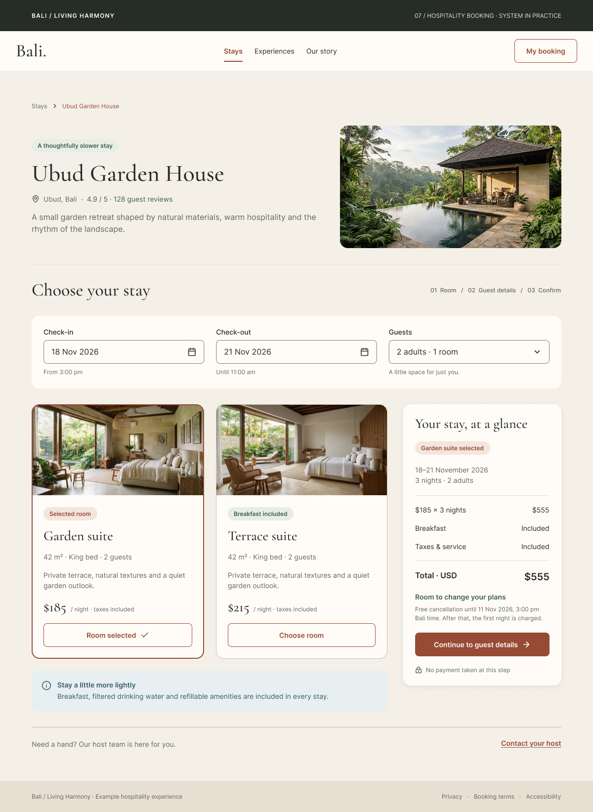
System in practice. The documented components are applied to a hospitality booking interface featuring accommodation selection, guest details, pricing summaries, and booking progress.
04 / Reflection
Bali / Living Harmony explores how a place-inspired visual direction can be translated into a structured digital design system. The project connects visual identity with practical interface requirements through documented color tokens, typography, spacing, component variants, and interaction states.
One important consideration was balancing expressive visual design with functional clarity. Natural material references and editorial typography establish the atmosphere, while consistent controls, readable information, and explicit interface states support the booking flow.
The system also adopts a deliberate approach to cultural representation, avoiding sacred symbols and ritual motifs as decorative interface elements. Instead, it draws on landscape, materials, craftsmanship, and composition to inform the visual language.
The documented system provides a foundation for implementation and further evaluation. Future work could include validating the components across devices, conducting accessibility checks on additional interface states, and consulting cultural practitioners to further examine the interpretation of Balinese design references.
Visual documentation.